Creating the perfect pin is easier said than done.
You can have the best Pinterest marketing tactics, be a part of the largest and most active group boards, as well as have killer blog content, but if you don’t have an awesome pin to send out, it may as well all be useless.
Pin Design
The goal of your pin is to entice viewers enough to click through to your website, and/or save the pin to their own board for future reference, and to push it to all their followers feeds.
I’ve gone through a lot of trial and error when it comes to creating a pin that will grab the attention of Pinterest users and here is what I’ve found.
I’d like to show you the evolution of my pins for this site you’re reading now:
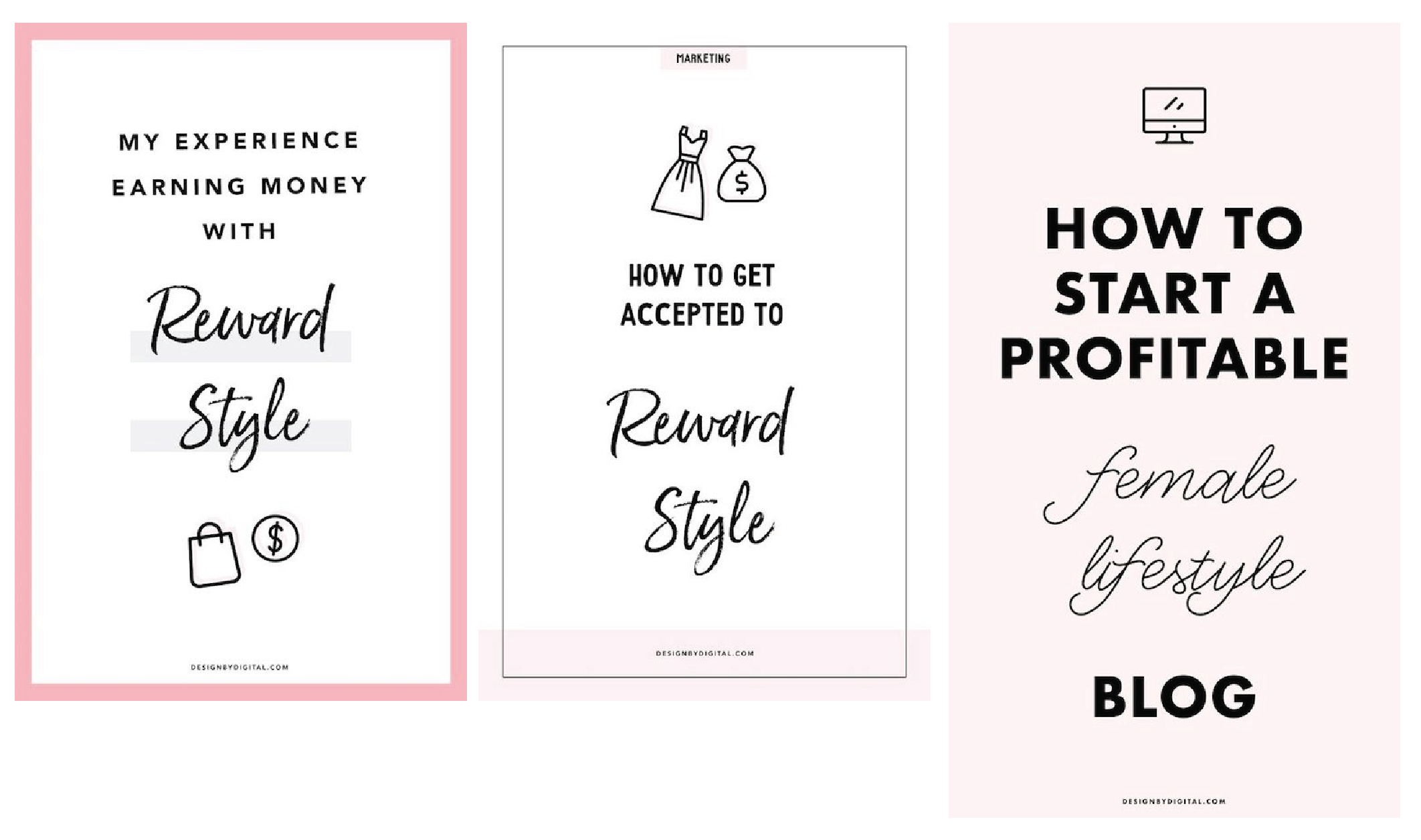
Before I talk about what changed, it’s important to take note of what I did right:
I made my pins vertical. Because of Pinterest’s layout, vertical pins appear larger than horizontal ones. Take advantage of this, and make your pins long! (Just not too long!)
I included my blog name at the bottom of the pin. This improves brand recognition as well as helps viewers avoid clicking spam links (ie. a spammer steals your graphic and redirects traffic to their own site)
I made multiple versions of a pin pointing to the same blog post. If you’re deciding between two words of layouts, try both and see which performs better!
Now, let’s talk about what changed.
I got rid of the hard-to-read fonts. As much as I loved the fun, handwriting font, it wasn’t easy to read from far away.
I made my font big and bold. Notice how there are no more than 1-2 words per line of my pin? This is great for a few reasons, it helps make your pin longer, and it really stands out on mobile devices. Keep in mind, the majority of Pinterest users are viewing your pins on a mobile device. Pinterest divides their feed into two columns, which means your tiny pins are appearing on only half of the screen! If people struggle even the slightest to read your pins, they’re going to move on to the next one. Don’t take that risk!
I kept my margins small. Your lettering should span as much of the width as possible without feeling overcrowded. You can also justify text if you wish, to help certain words stand out even more.
I kept it simple! While I had really pretty designs before, with outlines, etc. I decided to go back to basics and just put a really enticing blog title in bold letters, plain and simple, front and center. It works!
After I’ve created the perfect pin, I’m always sure to include a link to my website, write a keyword-rich description, and use hashtags.
You’re probably wondering if these changes made a difference in my traffic.
Well, the answer is YES!
Moving forward, I always check my Pinterest analytics to see what designs performed best before creating new pins.
In my experience, pins with text over 1-4 images work best.
Q: Should I use consistent layouts and branding for my pins?
A: I would not spend too much focusing on consistency at the beginning. In fact, you should try many different layouts and colors to see what works best for you. After you’ve been blogging for at least a year, then you can start considering limiting your pins to specific branding, colors, layouts, fonts, etc. It’s highly unlikely that viewers will recognize your branding at the beginning of your blog’s life, so don’t feel pressured to do this right away.
Now that you know how to create a pin, try these 5 amazing FREE tools for pin design!
You should also read how to skyrocket your Pinterest traffic, and optimize your use of Tailwind for scheduling your pins!